Colors
Choose your primary color in tailwind.config.cjs file
Primary color in tailwind.config.cjs #
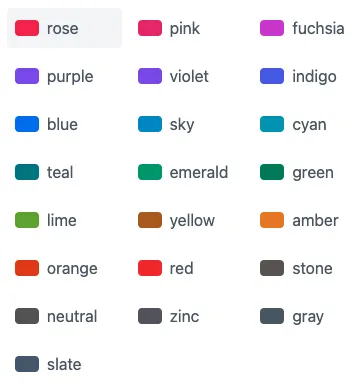
There are 22 colors defined in the tailwind.config.cjs.
For this demo, the primary color is set to rose:
primary: { "50": "#fff1f2", "100": "#ffe4e6", "200": "#fecdd3", "300": "#fda4af", "400": "#fb7185", "500": "#f43f5e", "600": "#e11d48", "700": "#be123c", "800": "#9f1239", "900": "#881337" }Examples #
Example
Primary
Noteworthy technology acquisitions 2021
Here are the biggest enterprise technology acquisitions of 2021 so far, in reverse chronological order.
Dismissable user notification.
- Svelte
<Button color="primary">Primary</Button>
<Alert color="primary">Primary</Alert>
<Card href="/cards" color="primary">
  <h5 class="mb-2 text-2xl font-bold tracking-tight text-gray-900 dark:text-red-800">Noteworthy technology acquisitions 2021</h5>
  <p class="font-normal text-gray-700 dark:text-gray-700 leading-tight">
    Here are the biggest enterprise technology acquisitions of 2021 so far, in reverse chronological order.
  </p>
</Card>
<Navbar let:hidden let:toggle color="primary">
  <NavBrand href="/">
    <img
      src="https://flowbite.com/docs/images/logo.svg"
      class="mr-3 h-6 sm:h-9"
      alt="Flowbite Logo"
    />
    <span class="self-center whitespace-nowrap text-xl font-semibold dark:text-red-800">
      Flowbite
    </span>
  </NavBrand>
  <NavHamburger on:click={toggle} />
  <NavUl {hidden}>
    <NavLi href="/" active={true}>Home</NavLi>
    <NavLi href="/about">About</NavLi>
    <NavLi href="/services">Services</NavLi>
    <NavLi href="/pricing">Pricing</NavLi>
    <NavLi href="/contact">Contact</NavLi>
  </NavUl>
</Navbar>
<Toast color="primary">
  <svelte:fragment slot="icon">
    <svg xmlns="http://www.w3.org/2000/svg" fill="none" viewBox="0 0 24 24" stroke-width="1.5" stroke="currentColor" class="w-6 h-6"><path stroke-linecap="round" stroke-linejoin="round" d="M15.362 5.214A8.252 8.252 0 0112 21 8.25 8.25 0 016.038 7.048 8.287 8.287 0 009 9.6a8.983 8.983 0 013.361-6.867 8.21 8.21 0 003 2.48z" /><path stroke-linecap="round" stroke-linejoin="round" d="M12 18a3.75 3.75 0 00.495-7.467 5.99 5.99 0 00-1.925 3.546 5.974 5.974 0 01-2.133-1A3.75 3.75 0 0012 18z" />
    </svg>
  </svelte:fragment>
  Dismissable user notification.
</Toast>